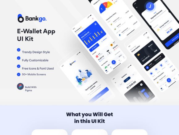
Bankgo - E-Wallet App UI Kit: A Designer's Blueprint for Modern Finance Apps
Imagine launching a sleek, professional mobile banking application in a fraction of the usual development time. For designers, developers, and fintech entrepreneurs, the gap between a brilliant financial concept and a polished user interface can often feel vast. This is precisely where a comprehensive design asset like the Bankgo - E-Wallet App UI Kit transforms the workflow. It’s not just a collection of screens; it’s a strategic toolkit designed to build trust, ensure usability, and deliver a visually stunning user experience from the first onboarding slide to the final transaction confirmation.
Why Visual Consistency is Non-Negotiable in Financial Apps
In the world of digital finance, your interface is your handshake. Users need to feel secure, understood, and in control. A disjointed or cluttered UI can immediately erode trust. The Bankgo kit addresses this by providing over 50 pixel-perfect screens that share a unified design language. Every component—from button styles and input fields to navigation bars and data visualization charts—is crafted to work together seamlessly. This inherent visual consistency is critical for brand recognition. When a user encounters the same thoughtful design patterns throughout their journey—whether they're checking their balance, scanning a QR code to pay, or reviewing transaction statistics—it builds familiarity and confidence in your platform.
Practical application goes beyond just looking good. Consider the onboarding flow. The Bankgo kit includes dedicated screens for this crucial first impression, allowing you to guide users through feature highlights and permissions requests in a clean, step-by-step manner. Similarly, the inclusion of Face ID and email verification screens means you can design for security without sacrificing aesthetic appeal. This attention to real-world user flows is what separates a theoretical design from a functional mobile app blueprint.
Leveraging Figma's Power for Effortless Customization
A UI kit's true value lies in its adaptability. The Bankgo kit is built to fully harness Figma's collaborative and dynamic features. It utilizes global color styles, which means you can rebrand the entire application—shifting from a vibrant blue to a sophisticated teal, for instance—with a few clicks. Font styles are similarly organized, ensuring typographic hierarchy remains intact as you swap typefaces to match your brand's voice. Need to adjust a component? The kit's dynamic components & variants allow you to modify states (like a button's default, hover, and disabled forms) efficiently without breaking the design system.
The organized layer and artboard structure is a silent productivity booster. Instead of hunting through a chaotic file, you can navigate intuitively to the "Transfer," "Profile," or "Statistic" artboard. The kit also includes over 70+ components—from icons to complex card layouts—that you can drag, drop, and reuse. This modularity is perfect for designers creating pitch decks or developers needing a clear visual reference. Furthermore, the inclusion of free fonts and icons eliminates licensing headaches for your initial prototype and can often be carried into the final product.
Practical Applications Beyond a Standard E-Wallet
While the kit is branded for E-Wallet and E-banking apps, its utility spans the entire financial technology and service sector. A finance app for personal budgeting can utilize the statistic and dashboard screens. A payment app for a retail chain can leverage the QR scan and transfer interfaces. The clean, modern aesthetic makes it suitable for any service where clarity and professionalism are paramount.
Think about the broader design assets you need to create. The UI kit's components can inspire and be adapted for:
- Marketing Materials: Use the clean iconography and layout principles from the app screens to design cohesive social media graphics or web design elements for your landing page.
- Brand Identity: The color palette and typographic choices within the kit can serve as a foundation for your wider brand identity, influencing everything from your logo to packaging design for any associated physical products.
- Presentation Templates: The organized artboards and data visualization elements (like the statistic screens) can be adapted into sleek templates for investor pitches or internal reviews.
- Editorial and Digital Content: The icons and simple illustrations can enhance blog posts about fintech or be used in digital products like e-books explaining your service.
Ensuring Readability and Professional Presentation
Financial data is dense. The Bankgo kit's design prioritizes readability through careful spacing, contrast, and typographic hierarchy. The availability of both Light & Dark Theme options is more than a stylistic choice; it’s a functional one. Dark mode can reduce eye strain in low-light conditions and is preferred by many users, while the light theme ensures clarity in bright environments. This consideration for user context enhances audience engagement and accessibility.
When customizing, pay close attention to font pairing. The kit likely pairs a highly legible sans serif font for body text with a complementary display font for headings. If you change these, test your new pairings rigorously. Ensure that numbers—critical in a finance app—remain distinct (e.g., clearly differentiating between '1', 'I', and 'l'). The goal is a professional presentation that never makes the user squint or second-guess the information they are seeing.
A Smart Starting Point for Your Fintech Vision
Starting a mobile app project from a blank canvas is daunting. The Bankgo - E-Wallet App UI Kit provides a robust, industry-aware starting point that accelerates your timeline and elevates your output. It embodies modern typography and clean design principles, giving you the tools to build an interface that feels both innovative and trustworthy. Remember, while the kit provides the framework, your unique value proposition and user research will bring it to life. Use it as a springboard for your own creativity, not a rigid constraint.
The true test of any design asset is its integration into your unique process. Dive into the file, explore the components, and see how they can be molded to your specific vision. Whether you're a solo entrepreneur validating an idea or a design team at an established firm, having a polished, functional UI kit like Bankgo in your arsenal is a strategic advantage. It allows you to focus more on solving user problems and less on reinventing basic interface wheels, ultimately bringing a superior financial product to market faster.